
English
Back
Open Account
Futubull Team
wrote a column · ·

Unlock the sector heat map in Futubull and open the "God's perspective" for market analysis.

Hello 牛友们大家好,本期玩转牛牛要为大家介绍一个十分好用的功能——板块热力图。
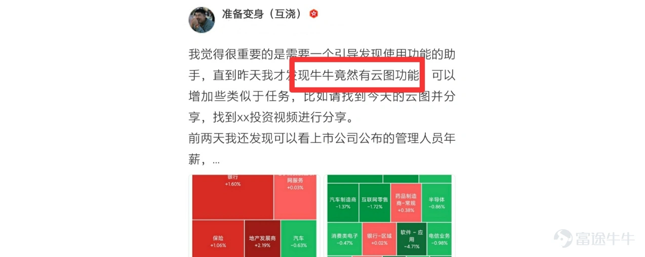
前段时间,牛牛在收集牛友们对产品功能的使用反馈的时候,注意到有牛友@准备变身(互浇)“富途牛牛竟然有云图功能!”来表达自己发现和使用“板块热力图”的惊喜。
Hello Mooer, everyone, in this issue of playing Tuniu, we will introduce a very useful feature - the sector heat map. Some time ago, Tuniu noticed some Mooers expressing their surprise at discovering and using the "sector heat map" when collecting feedback on product features.@准备变身(互浇)"Futubull actually has a cloud map feature!" to express their surprise at discovering and using the "sector heat map". Tuniu wants to say, yes, the Futubull "sector heat map" feature has been online for nearly half a year! If you haven't unlocked it yet, today Tuniu will show you what it's all about~ What is the sector heat map? A heat map visualizes the overall data of the entire market graphically, expressing the market cap and change in each industry based on the size and color depth of the blocks. Why use a sector heat map? 1) Intuitively overview market movements 热力图是把数据用图形展示出来的一个工具,是股票市场全景图。其最大优势是,通过人在客观认知上,最易于感知的形状、面积和颜色,来表达全市场数据的走势,活跃程度,甚至是情绪。比如,用面积的大小表示市值,颜色的深浅表示涨跌的幅度。市值越大的板块面积越大;涨幅越大的板块颜色越深。非常直观和具体,能够在最短的时间里面把握市场全局。 有调查研究显示,在股票看盘工具的使用中,要得到同样的信息量,使用“股票热力地图...
Futubull wants to say, yes, the 'Sector Heat Map' feature of Futubull has been launched for nearly half a year! If you haven't unlocked it yet, Futubull will show you around today~
What is the Sector Heat Map?
The heat map visualizes the overall market data graphically, expressing the market cap and changes in various industries based on the size and color depth of the color blocks.
Why use the Sector Heat Map?
1) Intuitively overview market fluctuations
The heat map is a tool that visualizes data graphically, like a panoramic view of the stock market. Its biggest advantage is that it uses shapes, sizes, and colors, which are the easiest for people to perceive objectively, to express the market trends, activity levels, and even emotions of the entire market. For example, the size of the area represents the market cap, and the depth of the color represents the extent of the increase or decrease. The larger the area of a sector with a larger market cap; the deeper the color of a sector with a larger price increase. It is very intuitive and specific, allowing you to grasp the overall market situation in the shortest time possible.
Studies have shown that in the use of stock market monitoring tools, to obtain the same amount of information, using the 'Stock Heat Map' can save 73% of timeIn other words, the efficiency of obtaining information using the stocks heat map is nearly four times higher than using traditional trading tools.
2) Selecting stocks based on industry.
The heat map can visually reflect the current market changes. When you see industries with dark colors, you can click on them. For example, in this map, the semiconductors sector stands out with a particularly dark color, indicating a significant increase in this sector within a specific time range, worth paying attention to. By clicking on this sector, you can see all the stocks within this sub-industry on the right-hand side.
Hello Mooer, everyone, in this issue of playing Tuniu, we will introduce a very useful feature - the sector heat map. Some time ago, Tuniu noticed some Mooers expressing their surprise at discovering and using the "sector heat map" when collecting feedback on product features.@准备变身(互浇)"Futubull actually has a cloud map feature!" to express their surprise at discovering and using the "sector heat map". Tuniu wants to say, yes, the Futubull "sector heat map" feature has been online for nearly half a year! If you haven't unlocked it yet, today Tuniu will show you what it's all about~ What is the sector heat map? A heat map visualizes the overall data of the entire market graphically, expressing the market cap and change in each industry based on the size and color depth of the blocks. Why use a sector heat map? 1) Intuitively overview market movements 热力图是把数据用图形展示出来的一个工具,是股票市场全景图。其最大优势是,通过人在客观认知上,最易于感知的形状、面积和颜色,来表达全市场数据的走势,活跃程度,甚至是情绪。比如,用面积的大小表示市值,颜色的深浅表示涨跌的幅度。市值越大的板块面积越大;涨幅越大的板块颜色越深。非常直观和具体,能够在最短的时间里面把握市场全局。 有调查研究显示,在股票看盘工具的使用中,要得到同样的信息量,使用“股票热力地图...
How to view sector heat maps?
1) Color block area.
The heat map supports drawing based on market cap, volume, and turnover. Taking the heat map drawn based on market cap as an example, the larger the total market cap of the stocks in a sector, the larger the color block area. The calculation method for color block area is as follows:
Sector area = Total area * Sector market cap / Total market cap
2) Color block color
Color block colors and shades are determined by the extent of the increase or decrease. The larger the extent of the increase or decrease, the darker the color.
Red indicates up, green indicates down:
Hello Mooer, everyone, in this issue of playing Tuniu, we will introduce a very useful feature - the sector heat map. Some time ago, Tuniu noticed some Mooers expressing their surprise at discovering and using the "sector heat map" when collecting feedback on product features.@准备变身(互浇)"Futubull actually has a cloud map feature!" to express their surprise at discovering and using the "sector heat map". Tuniu wants to say, yes, the Futubull "sector heat map" feature has been online for nearly half a year! If you haven't unlocked it yet, today Tuniu will show you what it's all about~ What is the sector heat map? A heat map visualizes the overall data of the entire market graphically, expressing the market cap and change in each industry based on the size and color depth of the blocks. Why use a sector heat map? 1) Intuitively overview market movements 热力图是把数据用图形展示出来的一个工具,是股票市场全景图。其最大优势是,通过人在客观认知上,最易于感知的形状、面积和颜色,来表达全市场数据的走势,活跃程度,甚至是情绪。比如,用面积的大小表示市值,颜色的深浅表示涨跌的幅度。市值越大的板块面积越大;涨幅越大的板块颜色越深。非常直观和具体,能够在最短的时间里面把握市场全局。 有调查研究显示,在股票看盘工具的使用中,要得到同样的信息量,使用“股票热力地图...
Green indicates up, red indicates down:
Hello Mooer, everyone, in this issue of playing Tuniu, we will introduce a very useful feature - the sector heat map. Some time ago, Tuniu noticed some Mooers expressing their surprise at discovering and using the "sector heat map" when collecting feedback on product features.@准备变身(互浇)"Futubull actually has a cloud map feature!" to express their surprise at discovering and using the "sector heat map". Tuniu wants to say, yes, the Futubull "sector heat map" feature has been online for nearly half a year! If you haven't unlocked it yet, today Tuniu will show you what it's all about~ What is the sector heat map? A heat map visualizes the overall data of the entire market graphically, expressing the market cap and change in each industry based on the size and color depth of the blocks. Why use a sector heat map? 1) Intuitively overview market movements 热力图是把数据用图形展示出来的一个工具,是股票市场全景图。其最大优势是,通过人在客观认知上,最易于感知的形状、面积和颜色,来表达全市场数据的走势,活跃程度,甚至是情绪。比如,用面积的大小表示市值,颜色的深浅表示涨跌的幅度。市值越大的板块面积越大;涨幅越大的板块颜色越深。非常直观和具体,能够在最短的时间里面把握市场全局。 有调查研究显示,在股票看盘工具的使用中,要得到同样的信息量,使用“股票热力地图...
3) Support custom settings
a. Sorting
Impact the order and area of sectors on the heat map, support sorting by market cap, volume, and turnover
b. Quantity
Number of sectors affecting the heat map, support selection of top 30, top 50, or all
c. Price change percentage
Sector color affecting the heat map, supports viewing by today, 5 minutes, 5 days, 10 days, 20 days, 60 days, 120 days, 250 days, and annual price changes
Sector heat map entrance:Market-Opportunities-Heat Map
Hello Mooer, everyone, in this issue of playing Tuniu, we will introduce a very useful feature - the sector heat map. Some time ago, Tuniu noticed some Mooers expressing their surprise at discovering and using the "sector heat map" when collecting feedback on product features.@准备变身(互浇)"Futubull actually has a cloud map feature!" to express their surprise at discovering and using the "sector heat map". Tuniu wants to say, yes, the Futubull "sector heat map" feature has been online for nearly half a year! If you haven't unlocked it yet, today Tuniu will show you what it's all about~ What is the sector heat map? A heat map visualizes the overall data of the entire market graphically, expressing the market cap and change in each industry based on the size and color depth of the blocks. Why use a sector heat map? 1) Intuitively overview market movements 热力图是把数据用图形展示出来的一个工具,是股票市场全景图。其最大优势是,通过人在客观认知上,最易于感知的形状、面积和颜色,来表达全市场数据的走势,活跃程度,甚至是情绪。比如,用面积的大小表示市值,颜色的深浅表示涨跌的幅度。市值越大的板块面积越大;涨幅越大的板块颜色越深。非常直观和具体,能够在最短的时间里面把握市场全局。 有调查研究显示,在股票看盘工具的使用中,要得到同样的信息量,使用“股票热力地图...
After reading the introduction, why not experience it for yourself, mooersMarket page - 'Opportunities' tabGive it a try! If you have any user experience and feedback suggestions to share, please join the discussion on topicsUnlock the sector heat map to start viewing the market from a 'God's perspective'.Mooer will reward you for your active participation.
Here's another good news, Futubull will support viewing the heat map of the australia market in April, stay tuned.
Risk Disclaimer: The above content only represents the author's view. It does not represent any position or investment advice of Futu. Futu makes no representation or warranty.Read more
Angry
1
Lol
1
Respect
1
Sob
3
Heart
17
Thumbs Up
75
7.9M Views
Report
Comments (28)
Write a Comment...
28
98
101